
As a Lancaster, PA native, there’s not much that says “Lancaster County” more than an Amish patchwork quilt. Okay, maybe Shoofly Pie. Still, walk into any tourist trap boasting “genuine Lancaster County crafts” and you’re bound to see at least one quilt hanging on the wall.
I’m reminded of Lancaster’s quilting tradition often by the pair of quilting frame legs stored in my own basement. No, I don’t quilt, and it’s been decades since they were last used. The frame legs, however, do speak to the importance of quilting in my own family’s past and are ornately embellished with my family’s last name.
It’s easy to see the elaborate patterns in patchwork quilts and assume that they originated out of a desire to create beauty. While this undoubtedly played a role, their origin story is actually much more utilitarian. Patchwork quilts allowed for the utilization of every available scrap of material. Some early quilts even incorporated used animal feed bags. They are intricate symbols of fiscal responsibility and good stewardship.
The Investment Patchwork Quilt
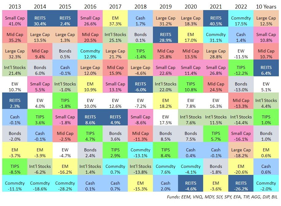
These days, I’m more intrigued by the investment version of a patchwork quilt. I am referring, of course, to the market asset class chart above. Sometimes referred to as the “quilt chart,” its similarities with patchwork quilts extends beyond just its patchwork aesthetic.
At first glance, this looks like a mess of disorganized tiles. But beneath the patchwork, there’s a method to the madness. Each calendar year across the top represents a column containing the performance of the same recurring 10 market sectors. The sectors’ performances are stacked in the column from worst to best.
The randomness of its pattern is a testament to the unpredictability of market winners and losers. Take commodities for instance (think agriculture, energy and precious metals). The teal tile that shows up at the top of 2022, with a 17.5% return, is dead last in performance over the past 10 years. It even underperforms cash. REITS (Real Estate Investment Trusts) went from last in 2020, to first in 2021 to last in 2022 again. Large Cap stocks had the highest average return over the past 10 years, but finished close to the bottom in 2022.
Beauty In Diversification
The broad disparity of returns on this investment quilt chart from one year to the next present a compelling argument for investment diversity. Investing across multiple sectors creates a more consistent pattern of returns than trying to guess a single winner each year.
As in quilting, it would be much less time intensive for investors to just grab their preferred colored piece of this chart and use it as a blanket portfolio. Imagine what we’d be missing. Or what we could be stuck with! Over-concentration in the wrong asset class could be devastating.
Building a cohesive product from a diverse selection of pieces takes more time, but the results are more desirable. For a quilter, this means using multiple pieces of fabric to produce elaborate patterns. For an investor, it means patching together a pattern of reduced volatility, limited risk and increased exposure to growth through investment diversity.
If building a well-diversified portfolio isn’t among your skill sets, we’d be more than happy to help.
